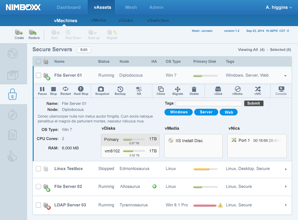
Above is a snapshot of the end result. We produced a concise interface that empowered our users control over a large, complicated electronic environment.
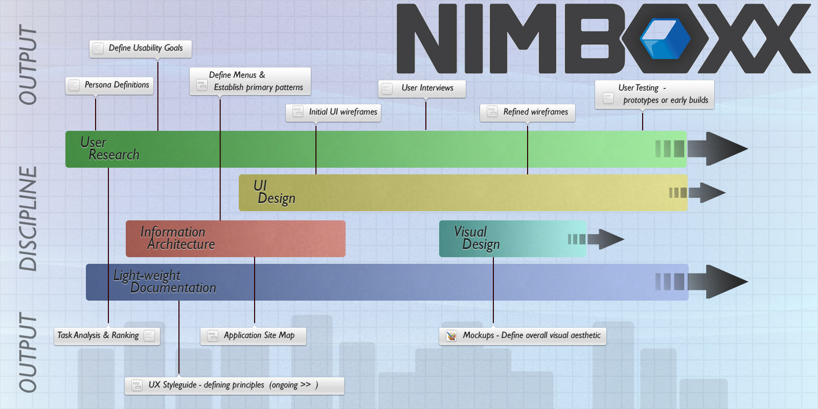
We can look at several stages of UX design that I led this organization through.
Strategy, Research & Analysis, Design, Production and tying back to Strategy decisions as the cycle repeated throughout design and build iterations.
This company had an interesting position in the marketplace. We were creating something that had few, if any strong competitors. By leveraging open-source technology infrastructure with a custom hardware platform, we were able to create an affordable solution for companies who were not comfortable moving (or were unable to move) their computing resources to the cloud.
Strategy
This company had an interesting position in the marketplace. We were creating something that had few, if any strong competitors. By leveraging open-source technology infrastructure with a custom hardware platform, we were able to create an affordable solution for companies who were not comfortable moving (or were unable to move) their computing resources to the cloud.
Stakeholder interviews were conducted with internal partners to validate the needs and expectations of the product.
The concept at the core of the organization was to deliver an easy-to-use solution to these companies and deliver more complex functional content that a novice user audience could harness.
As part of leading the UX strategy, I defined usability goals not only to help prioritize the key focus areas for the product, but to get the rest of the organization fully on board.
Another key aspect for the project was the creation and publication of a UX Styleguide. This helped others to learn and understand the motivations for many key design decisions.
Research & Analysis
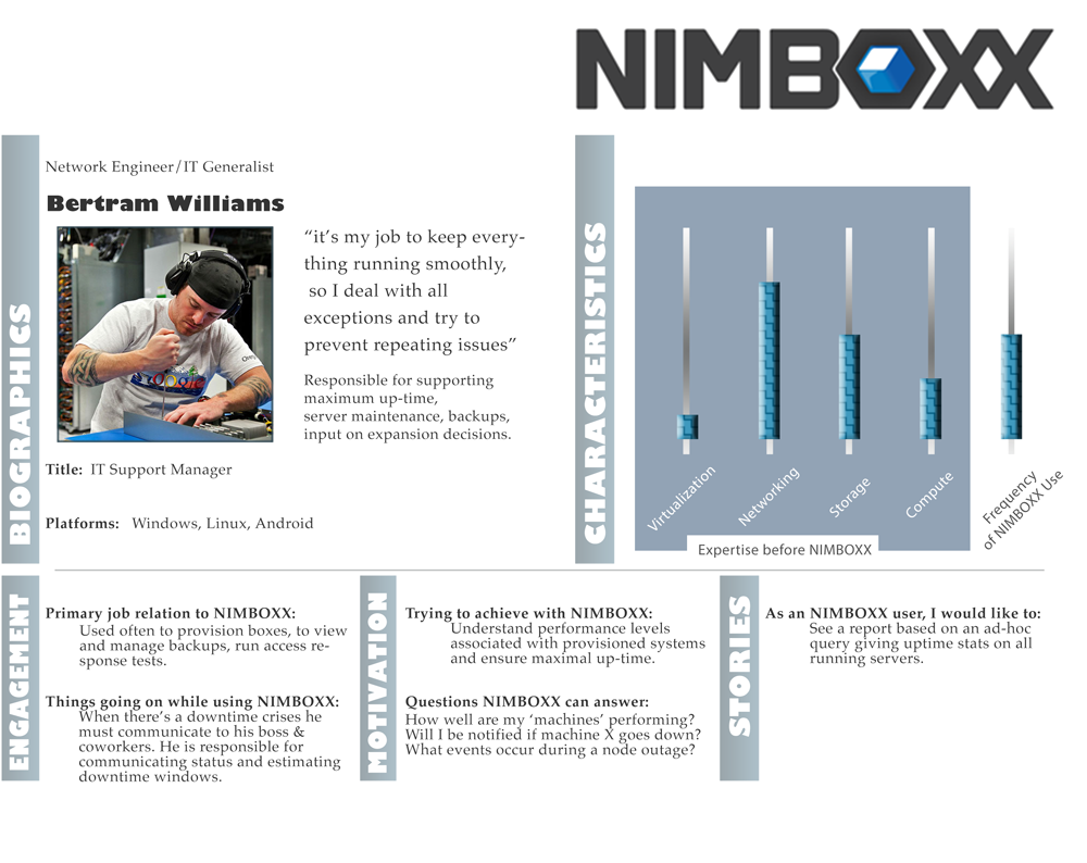
The business had already identified two primary targets as potential users of the product. First, was the experienced "expert" system administrator. This is the guy at a small-to-medium sized company who is responsible for managing the company's computer infrastructure.
The business had already identified two primary targets as potential users of the product. First, was the experienced "expert" system administrator. This is the guy at a small-to-medium sized company who is responsible for managing the company's computer infrastructure.
The second user audience we wanted to support was a less technically-savvy employee of the customer. Someone very familiar with their business, but with no background supporting an IT infrastructure. This person would need to perform many tasks normally facilitated by the tech people, but would simply not be comfortable staring at a blinking cursor at the front of a blank command line.
Conducting user research, I reached out to users of similar products. This served to identify the experienced audience and delve deep into their needs and expectations for the toolset. Additionally, I explored early research with people who would become users with the successful design and delivery of the toolkit to a wider audience.
During this phase, I created persona characters, validated and earned acceptance among the business organization. These characters served throughout the design and development process to narrow the team's focus onto things that would assist and not hinder these users.
One key design principle was to make two paths to complete many processes. One simple and streamlined, to be used by expert users who already knew what they were trying to accomplish. And two, to hold the hand of the user, ensuring that complex operations could be completed safely with the ability to roll back and to give no chance for catastrophic failure.
Task analysis was done to verify, validate and prioritize the functionality that users needed to perform with this toolset.

Design
With a clear understanding of who our users were and a definition of success for the product, I was able to set forward a definitive design for a successful product. I felt we had a solid start on the information architecture with an initial prototype (created before I came on board). However, there were a number of gimmicky hides and reveals of critical information that I felt hindered the product without adding anything substantive to the users' goals or objectives.
Legacy Interface in place when Drew joined the team
I clarified the system's architecture and provided clear, unambiguous routes for users to see key performance indicators and to quickly see and access outliers as well as to group systems in meaningful ways to the user.

Rough wireframes used to clarify the interface and advance the design patterns
After several iterations and rough prototypes with feedback from developers, leadership and select potential customers, we focused on the visual and refined interaction design.
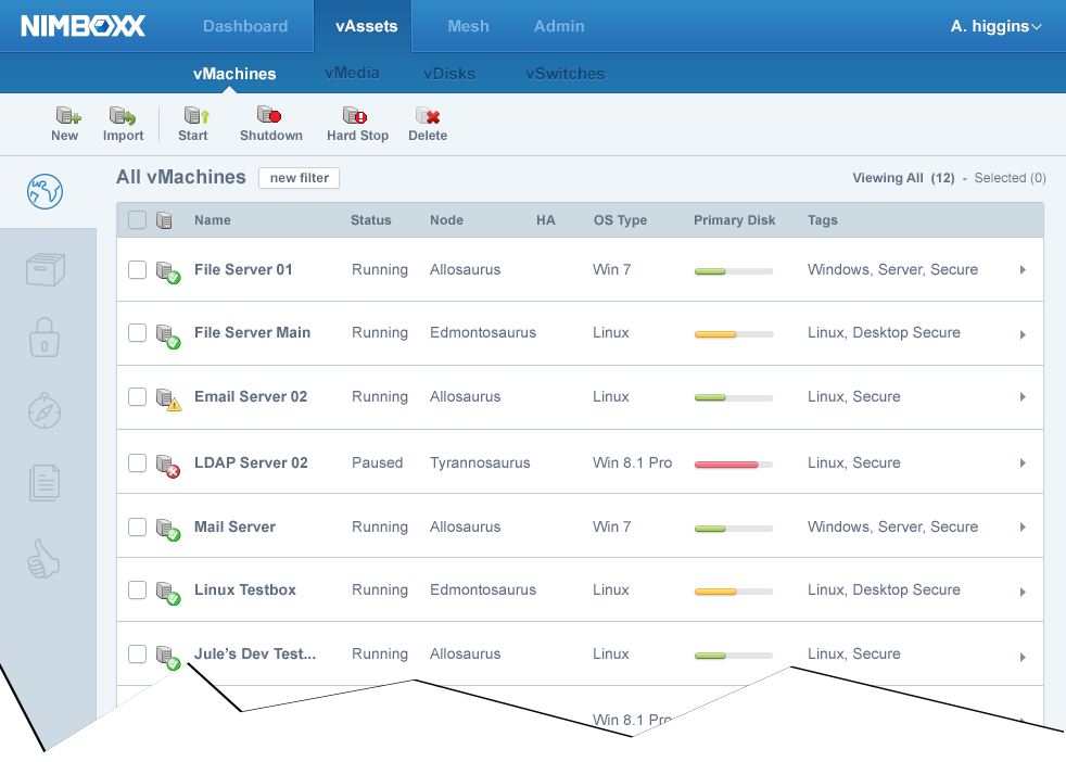
Finished clean UI in place after design and UX work.
Many common operations were studied and improvements sought for flow and timing of operations. Lots of conversations with the development staff helped identify weak spots in the application and revised priorities for seeking solutions.
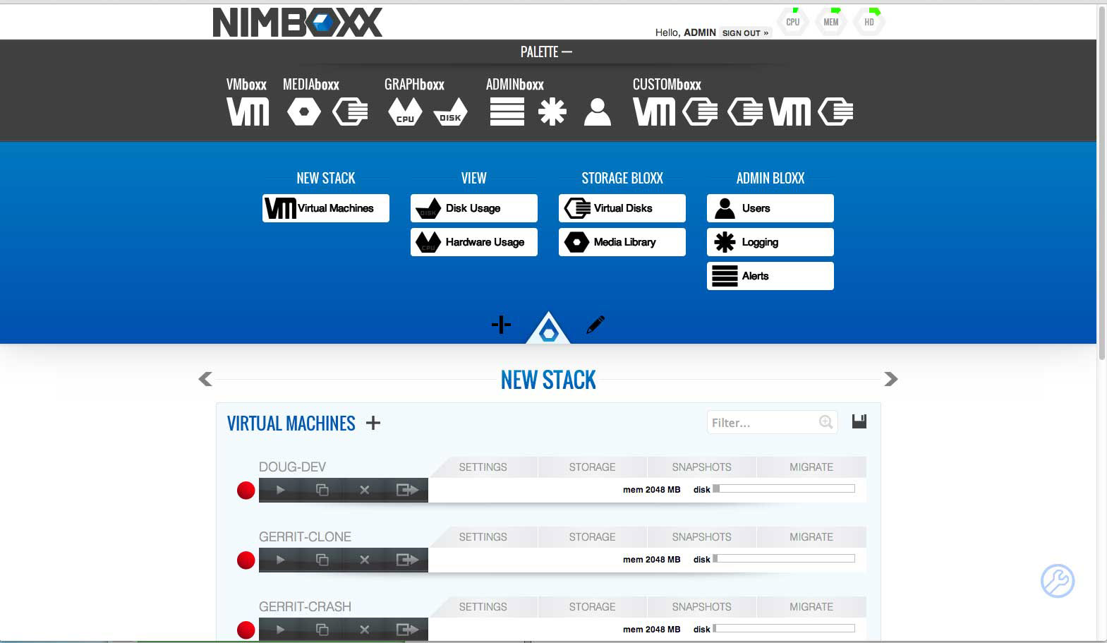
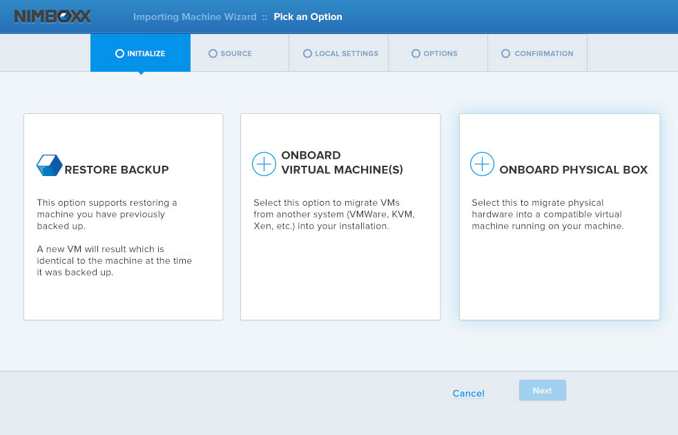
One function set that was identified as problematic was the creation of new elements in the system. We wanted to remove the modal pop-up window as the mechanism for creating new elements in the system. Its replacement was a non-modal drop-down pattern illustrated below.

The above view shows the drop-down pattern for creating a new virtual machine.
As a drop-down instead of a pop-up, users could move across the application to verify things like network settings or available software and come back with their unsaved changes persisted. The modal window that was part of the core coded system needed to be eliminated to help users with this data-heavy process.
As a drop-down instead of a pop-up, users could move across the application to verify things like network settings or available software and come back with their unsaved changes persisted. The modal window that was part of the core coded system needed to be eliminated to help users with this data-heavy process.
Production
During development, I assisted the dev team. Answering questions and clarifying aspects of the design that were not clearly defined or documented. My deep experience with Agile allowed me to facilitate the development process and give the dev teams what they needed as the product solidified and matured.
Key feedback was captured, especially around features that had to be scaled back from original designs as trade-offs were made. It was up to me to ensure that any "give" from the user was made up for in "gains" recovered in the next sprint.
Strategy
More formal user testing was facilitated during this follow-up in the process as well as key learnings discovered during the build cycles.
The company was responsive enough to the team and we could write new stories that allowed us to respond to things the team learned in earlier sprints.
With this focus, we hammered out a robust, mature tool in a very short amount of time.